For Exploring Medical Frontiers: Deep Learning for ICU Tabular Data and Image Registration

Tabular data learning
Introduction
Artificial intelligence(AI) has significantly transformed the landscape of medicine. AI has proven its effectiveness in aiding clinicians by facilitating diagnoses, finding new treatment regimes, and even predicting disease prognosis. However, while AI models have been successful in interpreting medical images, the realm of medical tabular data, which is routinely collected for daily medical usage, remains largely unexplored and challenging for model training. Several key factors contribute to the difference between image and tabular data:
Contextual Information: Medical image data encapsulates a wealth of contextual information within its visual representations. On the contrary, tabular data presents a sparser landscape. Pixels within an image often exhibit intercorrelation with their neighboring pixels, and therefore image models can theoretically find anything from the images. In contrast, the values in a column of a table do not inherently bear any guaranteed relation to adjacent columns. This inherent distinction necessitates extensive domain expertise to curate meaningful feature selection and engineering before effective model training.
Inherent Data Noisiness: While noise within medical images can be readily identified, localized, and rectified by individuals without advanced medical knowledge, challenges arise when handling tabular data. For instance, a layman might be able to identify the values outside of the normal range of blood pressure, yet may lack the awareness to rectify data where diastolic pressure is higher than systolic pressure. Such anomalies likely result from handwriting errors during data documentation and can be intricate to correct if someone doesn’t even know it is an issue in the data.
Pervasive Data Sparsity: Medical data frequently presents high levels of sparsity. Tabular medical records are primarily recorded for medical purposes and patients have distinct combinations of data because of their highly different medical status. Consequently, it’s common to see that features A, B, and C documented in patient X’s medical record can’t be found in patient Y’s records. In other words, lots of missing values (around 75%-90% of the cell) will be expected to be seen in the table.
In this article, we aim to address these three challenges by employing the contexts of intubation and sepsis prediction as illustrative examples. The dataset concerning intubation was fetched from the Taipei Medical University database, while the sepsis data was downloaded from the 2019 sepsis early prediction open dataset on Kaggle.
Method
Data collection:
Intubation: The intubation data was fetched and curated from the Taipei Medical University database, which resides on NAS. This dataset comprises 44 laboratory features (blood gas analysis, regular blood tests, renal profiles, metabolic exams, and liver functions) and 7 dynamic features (diastolic/systolic/mean arterial pressure, breath rate, heart rate, O2 saturation, and temperature). The curation of this data was based on medical knowledge. Extreme and unreasonable values (e.g., temperature = 370, which should be 37.0) were removed. The labels and timestamps indicating whether and when a patient was intubated were derived from the database’s billing time log. Following the patient selection pipeline, approximately 7,700 patients with qualified data were included, of which 3.9% were intubated (designated as the positive tag).
Sepsis: The sepsis dataset was downloaded directly from Kaggle. This dataset comprises 27 lab features, 7 dynamic features, and 5 static features (such as Age, Sex, ICU unit, etc.). The data was curated using medical knowledge, and extreme and unreasonable values were eliminated. Following the patient selection pipeline, approximately 40,000 patients with qualified data were included. Among them, 1.1% of the patients were labeled as positive (sepsis occurred within the stay in the ICU).
Data curation:
Data curation is one of the most challenging and pivotal tasks in tabular data learning, particularly when considering the ETL (Extract, Transform, Load) pipeline. An engineer responsible for data retrieval may not be familiar with distinctions between white blood cell (WBC) counts in urine, blood, or cerebrospinal fluid (CSF). Consequently, data might be extracted for various medical purposes and different value ranges, all of which could be placed within a single column.
A straightforward approach to identify this issue is plotting the data distribution before any preprocessing or post-processing steps. This provides an initial impression of the data. Generally, most medical data should exhibit a unimodal distribution, closely resembling a normal distribution, or displaying left or right skewness. For instance, consider the distribution of recorded heart rates (HR):
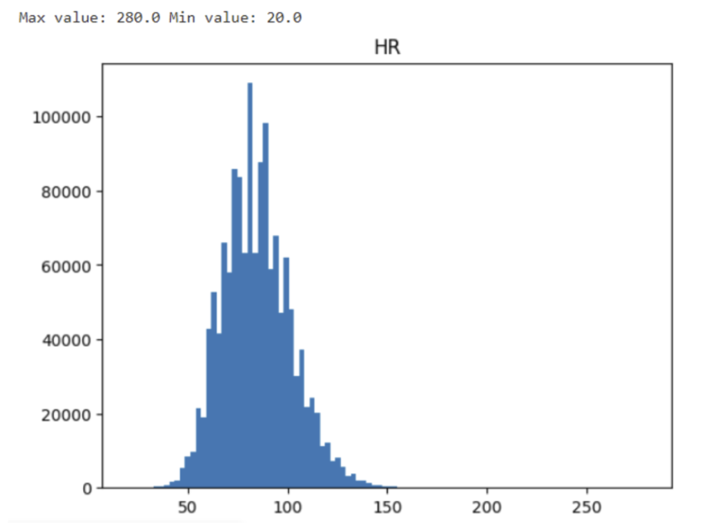
Although some extreme values might intrigue one’s attention, the value 280 might result from a physically possible tachycardia event and the minimal value of 28 could be the result of a dying patient. Do not eliminate data before second inspection. Let’s dig out the patients generating these extreme values.
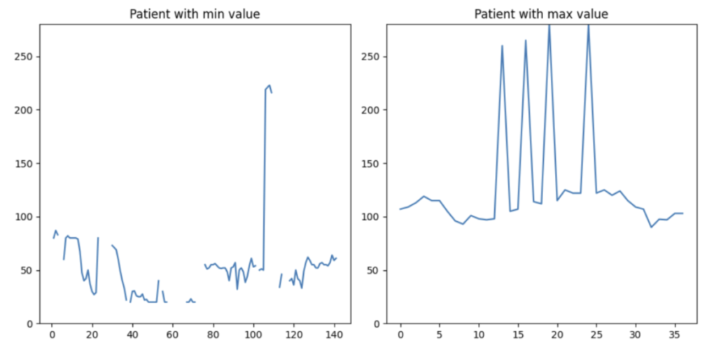
The data in the right plot is more comprehensible. This patient exhibits occasional tachycardia, likely due to medication. On the left plot, the patient’s data is considerably more intricate. The plot displays extremely high and low HR values. However, both scenarios are observed in clinical practice. As engineers, we should not cap or discard a single data point solely based on value thresholds. Instead, if we have the luxury of losing some patients in the data, I would like to drop this patient from my training set (the patient on the left-hand side).
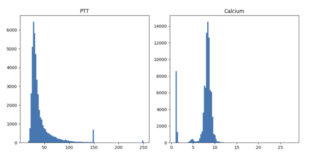
Unfortunately, numerous potential scenarios demand thorough examinations. For instance, the distribution of PTT values exhibits an unusual spike at 150 and 250 units, which corresponds to the maximum time interval set by hospitals for blood coagulation measurement. On the contrary, the abnormal distribution of calcium levels results from erroneously recording calcium values from varied measurements and units—a significant oversight. The process of data cleaning proves to be intricate and laborious. It is my belief that the optimal strategy to navigate this challenging endeavor is through close collaboration with clinical professionals.
Modeling:
There are at least two ways for modeling the prediction questions.
- Static prediction (or left alignment): Based on the first 24-hour data after entering the ICUs, what’s the possibility of a patient getting sepsis during the ICU stay?
- Real-time prediction (or sliding window): Based on the data in the previous X-hour window, what’s the possibility of a patient getting sepsis in the next 24 hours?
XGBoost was selected for solving the left alignment problem due to its excellent ability of handling missing values. For the sliding window problem, we test the commonly-selected LSTM model for multivariate time-series prediction.
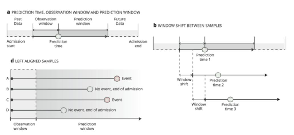
(a) Observation window: the data used for building models. Prediction window: if an event occurs in this window, the instance (patient) will be considered positive. (b) Sliding window: the observation and prediction windows will change with time evolving. (d) Left alignment: all instances have the same starting point and size of observation window.
Image courtesy: https://www.nature.com/articles/s41746-021-00529-x
Feature augmentation and time compression:
For the left alignment task, a single instance can consist of several rows of data. One approach to summarize multiple data points within the observation window is through statistical summarization. To be more specific, we have chosen the minimum, average, and maximum values of a feature of an instance within the window to represent its behavior over this time span. This approach also offers the advantage that if a feature has at least one data point within the observation window, it will not result in troublesome missing values for the models later on.
Baseline:
The recent consensus for diagnosing sepsis is the Sepsis-3 agenda, which was published in 2016. In this agenda, a diagnosis of sepsis is considered when a person exhibits clear manifestations of infection and shows an increase in the SOFA score of 2 or more. It is worth mentioning that the Sepsis-3 consensus is only used for making current diagnoses and not for forecasting future occurrences. In our approach, we utilize a WBC level over 10,000/μl as a proxy for infection and estimate the SOFA score accordingly. We apply the Sepsis-3 criteria in an off-label manner to predict the occurrence of sepsis in the future. We then use the results as a baseline for comparison with our models.
Result
Intubation prediction, left alignment
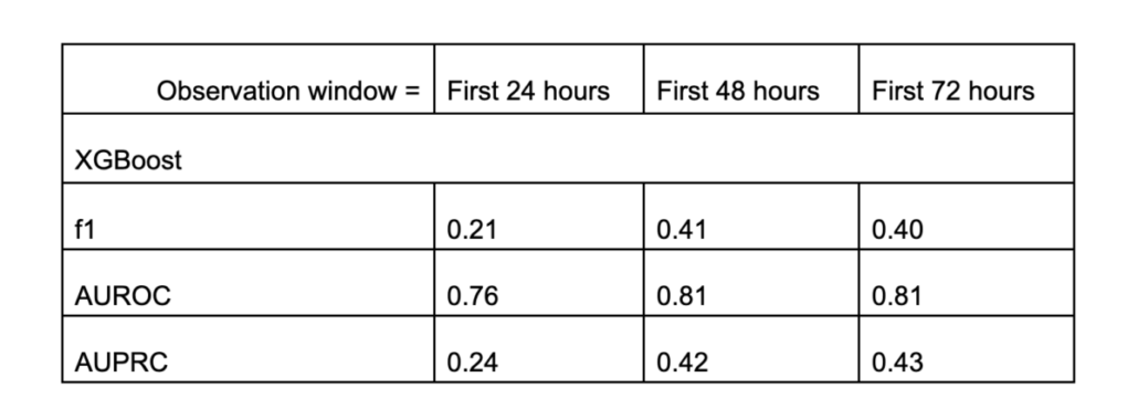
From the table, we can see that the XGBoost model significantly outperforms random guessing (with a prevalence rate of 0.04). With this model, a doctor is capable of predicting whether a patient is highly likely to require intubation and ventilation during their ICU stay. The model performs even better when it can access the first 48 hours of data instead of only the first 24 hours. However, this improvement was not observed when we further extended the observation window from 48 to 72 hours.
Another important thing is this model’s explainability. Let’s examine the feature importance:
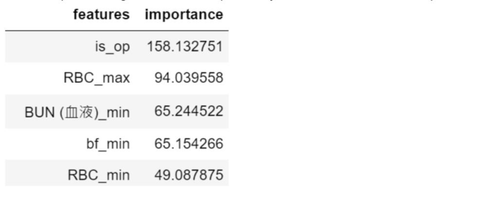
The foremost influential factor (is_op) in forecasting intubation is whether the patient is admitted to the ICU after a major surgery. The second factor (RBC_max) is the maximal concentration of red blood cells in the data window, which is associated with the patient’s oxygenation ability. The third factor (BUN_min) is an indicator of a patient’s renal function, closely tied to the assessment of osmolality. The fourth factor (bf_min) is the slowest breathing rate recorded in the data window, which directly evaluates a patient’s lung function. All of these factors are medically connected to determining a patient’s need for intubation.
Sepsis prediction, left alignment
The second task is to build a model on a more homogenous dataset and try to repeat the success we did on the intubation task.
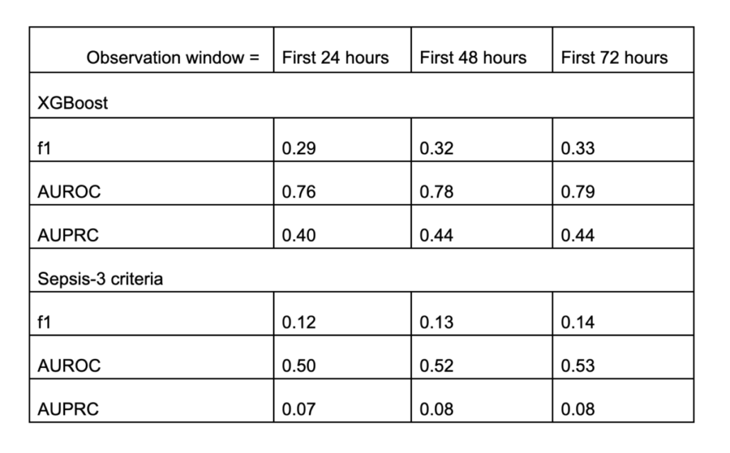
Similar conclusion! The XGBoost model is again capable of forecasting sepsis occurrences! But the increment from 48 to 72 hours is not prominent. When compared to the Sepsis-3 criteria, our XGBoost model clearly outperforms in all the metrics measured.
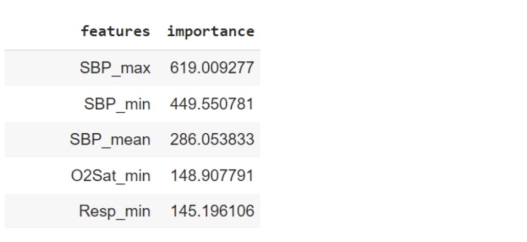
The prediction highlighted systolic pressure (SBP). This leads us to speculate that the model aims to predict organ failure and the consequent hypotension (low systolic blood pressure). The lung function is additionally assessed by oxygenation level (O2Sat_min) and respiratory rate (Resp_min).
Sepsis prediction, sliding window
Finally, we challenged ourselves by transitioning to sliding window prediction. Sliding window, also known as real-time prediction, is of paramount importance in the clinical realm, as it offers instantaneous monitoring and awareness of sepsis occurrences.
Unlike the left alignment approach, sliding-window-based prediction is exceedingly challenging due to the highly imbalanced class labels. Consider a patient who was diagnosed with sepsis at the 72nd hour. In other words, when we break down this patient’s data into an hourly-based resolution, there are 71 negative data points and only 1 positive data point (the data points after the occurrence of sepsis are not significant and were not recorded in the dataset). Consequently, the sliding window model must detect subtle time-variant signals from an incredibly imbalanced dataset. In the end, merely 0.18% of the prediction cases were labeled as positive, establishing our random guessing baseline.
Our current model demonstrates a time-independent AUC of 0.72, albeit with a less favorable f1-score of 0.008 and an AUPRC of 0.008. At first glance, this might not appear overly promising. However, it represents a significant improvement over using the Sepsis-3 criteria for predictions, where the f1-score is 0.00, AUC is 0.50, and the AUPRC is 0.002 for the same task. When interpreting these results, it’s important to keep in mind that this model is aiming to detect the proverbial “needle in a haystack”—a target occurrence of one in a thousand. From this perspective, our model has performed fairly well. Nevertheless, there remains substantial room for improvement, and I’ll leave this final step for you to explore.
Image registration
Introduction
It is common for patients to have more than one image, either from the same or different modality. Clinicians can benefit from obtaining images from multiple modalities or time points to gain a holistic understanding of the patient’s condition. For example, a doctor may require daily X-rays to assess a patient’s pneumonia status. One pivotal aspect of this integration is image registration – a process that aligns multiple images of the same or different modalities into a unified coordinate space.
However, the integration of imaging data poses challenges: the images are often acquired in different positions, orientations, and scales, making direct comparisons or joint analyses cumbersome. This is where image registration emerges as a crucial solution. By computationally and automatically aligning images from different modalities or multiple time points, medical professionals can create a unified visualization that enables them to integrate information from various sources. Moreover, a deep learning model trained on these sets of images is likely to achieve higher performance and robustness.
Medical image registration is not a trivial process. Due to the intricacies of the human body, a simple affine transformation (translation and linear transform) is incapable of delivering satisfactory results. Moreover, learning targets for the ground truth displacement field, a field (or matrix) that dictates how to shift the pixels from the source image to the target image, are rarely available. This characteristic renders supervised learning impractical. Most significantly, traditional registration methods typically require over 7 minutes to complete the task for only one single image, making these conventional algorithms unlikely to be deployed for practical use.
VoxelMorph is a deep-learning-based registration model that directly learns the displacement field from the source and reference images. Unlike traditional methods, VoxelMorph can generate a registration displacement field for a 3D image within 0.1 seconds. At its core, VoxelMorph takes two images (source and reference images) as inputs to its U-Net-like architecture and learns the relationship between the pixels of these two images. The output field can be directly applied to the images and appended with image features (such as segmentation masks or key landmarks). Notably, VoxelMorph is an unsupervised model, making it ideal for handling diverse clinical scenarios.
This article is to test VoxelMorph’s ability on registering MR images and pave the way for our future use.
Method
Objective function
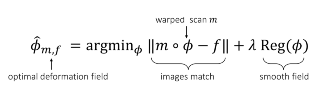
Courtesy: From the VoxelMorph paper.
The objective function of training a VoxelMorph model is simple. We are attempting to find a function Φ that can be applied to the source image (denoted as “m,” representing the “moving” image), and the resulting images, mΦ, should closely resemble the reference image, denoted as “f” (representing the “fixed” image). Additionally, we apply a universal regularization term to the model weights to prevent overfitting on a single image.
Data collection
We downloaded the data directly from the Learn2Reg Challenge and selected the OASIS dataset for conducting the registration test. This dataset comprises 454 T1-weighted MRI images, and our objective is to register any two randomly chosen images and achieve anatomical alignment between them.
Result
The visualized result is presented in the figure below. As evident, one of the major distinctions between the source images (moving images) and the reference images (fixed images) lies in the size of the ventricles – the black chambers within the brains. Upon applying the model to the images, the registered images (moved images) present ventricles of similar sizes to the reference images. Consider the scenario where ventricle volume estimation is crucial for diagnosis (e.g., enlarged ventricles possibly indicating brain fluid injury or blockage, such as CSF reabsorption issues); this registration process could significantly impact the model’s prediction accuracy and overall performance.
Except for the visual results, we also calculated the dice scores between the segmentation masks (important regions in the brains) of the registered images and the reference images. The average dice score among 49 patients in the test set is 0.976, verifying the success of our trained model.

